Wednesday, January 28, 2009

2016 Madrid, Spain Summer Olympic Games


I chose Madrid, Spain for 2016 Summer Olympic games. There is so much to tell about Madrid. To start with it is the capital of Spain. Also, it's one of the few largest cities in the world that has never hosted olympic games. Madrid is one of the 4 candidates for the 2016 olympics as of right now. The final host will be announce on october 2, 2009.

I'm looking for a simple design and yet contemporary. 
Sunday, January 25, 2009


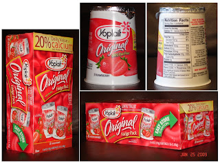
GOOD PACKAGING DESIGN

This is my most favorite design. I like the contrast between the red and white. The colors have created a sense of energy and fun. There are 8 of small packages in one box. The box design matched the design of the actual yogurt. There's a good balance and hierarchy. There're repetitions such as the logo. 
GOOD PACKAGING DESIGN

DAVINCI LASAGNE is currently one the top sellers. I like the packaging design mainly because of the clear that allows consumers to see the product inside (interior) as soon as the box (exterior)! The Lasagne's have curves and that has created a unique style which is fun and at the same time elegant. The colors are well chosen. They have created contrast between the color of the box and the Lasagne. Having a white logo on the dark blue background also helps the design to stand out. 


GOOD PACKAGING DESIGN

FRESH GOURMET is well designed. The image on the front is very sharp. Color saturation has been adjusted to a natural level. The overall design is very clean specially considering the white background. The typeface is well chosen. By adding the ziplock on the top, the packaging is practical. Not only it stays fresh but also preserves the scent. The important information is listed on the back and it's very easy to read although the package is not in a box format. 


BAD PACKAGING DESIGN

COFFEE CRYSTALS by RALPHS is not the most outstanding coffee on the shelves as far as the jar and design. Color choices are very limited and there's not much of contrast and different values between the colors. The design could stand out a lot more if more white or gold were added instead of purple. 
BAD PACKAGING DESIGN

This is a very simple design. The green bottle helps to hide the discoloring of lemon juice after a while sitting on shelves however, I think it could have been designed much better. It's very generic and doesn't stand out. The image color is the same color as the background. There's no contrast except where the name BYBLOS is. The typeface could have been more modern and fun. The arrow shows the misplacement of the label. 
BAD PACKAGING DESIGN

QUAKER CHEWY is a healthy bar brand which is sold separately at various stores. Costco sells 60 of them in one box which is more cost efficient. The design on the actual box is selling the product which is good. But the way the box has been designed doesn't protect the product inside. These healthy bars are very soft and break easily. All 60 bars are just dropped in to the box with out any organizational system therefor they are mostly bended or broken. Another reason why I think this is not a good packaging design is because there are three different flavors in each box. It's not easy for the consumer to find the flavor he/she is looking for. The only way someone can find one flavor out of 60 bars is to bring a few out.