GOOD PACKAGING DESIGN
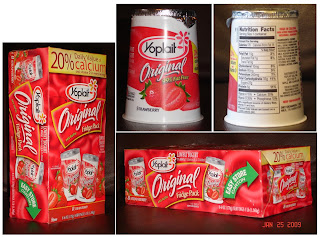
This is my most favorite design. I like the contrast between the red and white. The colors have created a sense of energy and fun. There are 8 of small packages in one box. The box design matched the design of the actual yogurt. There's a good balance and hierarchy. There're repetitions such as the logo.

I love these because it's good for single use and you can stack it in the fridge.
ReplyDeleteThank you for posting multiple angles! It's very helpful. I like the Yoplait containers have become identifiable. Their individual designs are great and look uniform.
ReplyDeleteI can understand the desire to make different faces of the box alike, so that one knows what the box is for on any side, however the images get somewhat redundant.
I really like the design of this product. That red and white catches your attention instantly. This design itself is very inviting. I'm getting kind of hungry looking at this product.
ReplyDelete